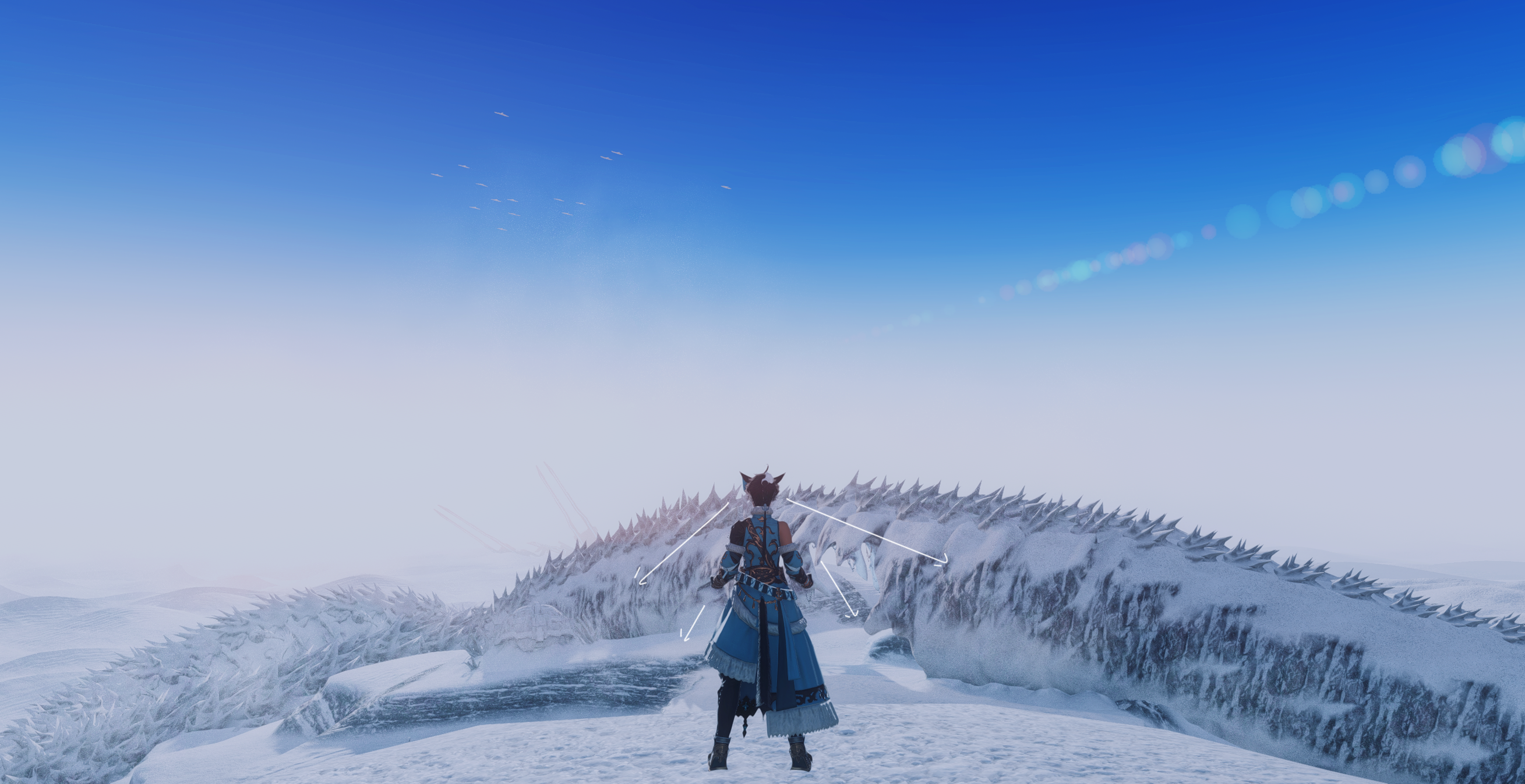
Basics of composition
Composition is how we arrange individual elements in our photographs to either tell a story or simply look enticing to the viewer. There’s many techniques that can aid you in how you construct your picture. I will be covering majority of them in separate guides but let’s start with the basics. The purpose of this guide is to get you started on thinking with composition in mind. We’re going to deconstruct an image into elements and see how adjusting their placement might drastically alter what impression your image will leave with the viewer.
What’s in a picture?
Dissecting elements

We’re going to start by dissecting our scene. I’ve taken the above image to give us a clear look at exactly what is at our disposal in our surroundings. We’re starting simple so there’s three different elements we’ll focus on. These being the character, the backdrop and the birds in the sky.
The general idea we want to explore is how placing these elements differently can greatly influence what kind of story they tell.
Let’s put this into practice.
Placement of elements

My intent with this image is portraying perhaps an early morning training scene. The character climbed all the way up here and is now catching her breath, taking in the fresh air. For the most part, this composition aids in telling that story. From the way her head is angled to the position of the birds in the sky. Even her clothes and pose the rest of the body holds aid this narrative.

So let’s move one of these elements, the birds. The story told has now changed. Rather than the character catching her breath after what might be very intense physical exercise, she’s now looking at the birds in the sky. Nothing wrong with that, but it’s not my intent. It’s also a little less dramatic, don’t you agree?
Adjusting angles

Another issue with the narrative I was trying to convey is that she climbed up there and is therefore catching her breath. This is where the environment comes into play. We don’t really know what’s going on behind her or in front of her in the previous pictures. We can generally guess she is high up due to the appearance of the sky, but that might not be too obvious.
For these reasons, I add a new element, which is the scenery before her. Now there’s no questioning that she’s atop of a summit looking down. Again the story has changed slightly because rather than taking in that breath of fresh air, with the way I angled her head she’s now taking in the scene before her. It’s these small changes that can change the intent of an image entirely.

That all said and done, a change in the composition doesn’t have to be influenced by the want or need to tell a different story in the image. Sometimes, something just looks more aesthetically pleasing if you place it differently.
For example, the above image is nearly identical as the previous one. The only difference is that I really did not like how the birds were in focus and cut off. By taking the shot as they’re further in the distance, the image becomes more harmonious.
Essentially, there’s no harm in saying “Well, this just looks better”.

No comments to display
No comments to display